DecoRational
Ornament is no longer criminal
Design is rediscovering 'deco.' Industrial and graphic designers, architects and interior designers lust for ornament and pattern. There is, however a difference; decoration is not the same as 'decorational.' Design critic Denise Gonzales Crisp explains.
Over the last few decades, we have seen a regeneration of ornamental form and formal systems, and a modernization of craft and production. A reinvigoration of visual pleasure and surprise, without irony or nostalgic sentiment. More than a few industrial and graphic designers, architects and interior designers are reinventing the terms by which their disciplines evaluate the potent function and message of deco. Unwitting adherents to the DecoRational, they exemplify its characteristics. In this, our Etsy-slash-DIY millennial dawn, craft appears to be a way of inhabiting some preternatural past, harkening to grandmas who transformed old shirts and sheets into delicately hand-stitched quilts. Such craftiness may signal a return to “what matters,” or be a relaxing and satisfying activity for creative people looking to unplug, but I see it as a decorative reawakening. A revival that offers insight into a concurrent trajectory being realized in the design disciplines proper, and which may prove to be decoration’s renewal.
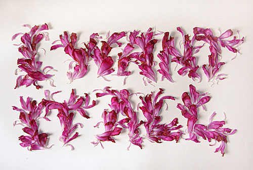
Marian Bantjes: I Want It All, 2006. Calligraphy with petals.
True believers among the higher tiers of early and mid-twentieth century European architecture and industrial design yielded to Adolf Loos’s famous verdict “Ornament ist Verbrechen” (Ornament is crime, 1908). Those designers who professed the modernist aesthetic framed any decorative bent in its terms. The Eames’, for instance, called it “functional decoration.” But as tempting as it is to wag a finger at modernist idealists for squelching decorative impulses, to do so lacks perspective. In graphic design and advertising, for instance, the Swiss Typographic style may have dominated trends for decades, but it was hardly the only game in town. When considered in a larger cultural context, the outcomes of Loosian modernism represent only a fraction of all design production, especially in the latter third of the twentieth century. Decorative stuff saturated adverts and books and furniture and walls throughout the twentieth century as high design was cultivating its terse and serious-minded aesthetic. In the shadow of modernism’s innovators, thousands of unheralded practitioners generated doodads on demand. The only deficit such work suffered was under-representation in written canonical design histories. Solid reasoning informed its exclusion, no doubt. However the lack of ink doesn’t prove lack of influence.
As early as the nineteen-sixties, designers in the U.S. and Europe began to venture away from modernist leanings by flaunting the extraneous. Herb Lubalin (US) sprouted decorative logotypes and over-the-top publication design. The Push Pin Studio (US) drew inspiration from nineteenth century decorated types and sorts. Similarly, Tadanori Yokoo (JP) developed a signature style that tested the limits of “too much.” Although such work borrowed from proto- and pre-modernist visual languages as well as craft vernacular, it looked new. And proposed decoration as a design alternative.
The late seventies through the eighties brought visual hyperbole that explicitly challenged high-modern constraints. Ettore Sottsass’ (IT) and the Memphis Group’s widely circulated work was an affront to reductivist ideals and celebrated decoration as a way to inject functional objects with joy. New Wave proliferated in the rebellious and daring hands of Paula Scher and April Greiman (US), Barney Bubbles (UK), Grapus (FR) and Hard Werken (NL), to name but a few. Architects Michael Graves, and Venturi/Rauch/Scott Brown (US) — whose work alternately sits under the flags “Postmodernism” and “Ornamentalism” — blatantly decorated building surfaces, furnishings and products. Dan Friedman (US) called his work "radical modernism," and promoted “a reaffirmation of the idealistic roots of our modernity, adjusted to include more of our diverse culture, history, research, and fantasy.”
Not so radical, it turns out. Their greater influence was to elevate already ubiquitous tendencies present in homes and commercial enterprises everywhere: exuberant variety for a rising leisure class. It arrived covered in commercial expediency (on the lowbrow side) or irony and irreverence (on the highbrow side), frequently with greater regard for surprise and shock than originality (across the spectrum).
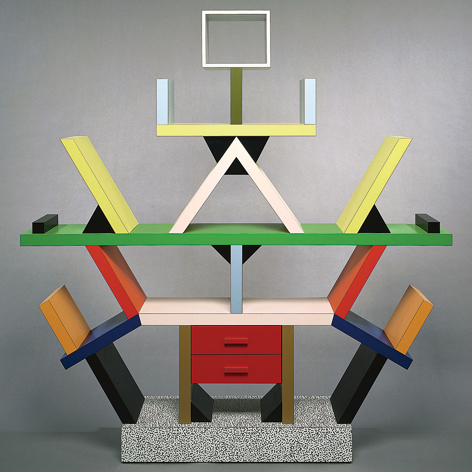
Ettore Sottsass: Carlton book case, 1981
Clamoring for effusive expression continues to resonate, despite the modernist aesthetic now reaching maximum reproduction, imitation and distribution. Versions of postmodernism, ornamentalism and other design-isms of the latter twentieth century burned fiercely, but they did not combust into oblivion. Once anomaly, the sensibilities and exuberant artifacts of ‘seventies and ‘eighties new wave deco are now legacy to a current surge. Whereas their predecessors kicked at modernism’s hegemony, the descendants of the decorative impulse build sociable diversity. They draw from history without a smirk. And the beauty they create is in conversation with more contexts than design practice, manufacture and discourse.
Ornament, Decoration, and DecoRational
In his book Ornament: A Modern Perspective, art historian James Trilling asserts: “all ornament is decoration, but not all decoration is ornament.” Ornament is integral to the structure, say a basic chair or building; objects that function perfectly well without embellishment. Sometimes ornament is so integrated with utility that the artifact could not exist without it. Karsten Schmidt designed TypeFormCode for Print magazine, a three-dimensional word-object in which digitally plotted, real material extrusions form a void of letters. Were the ornament to disappear, so would the words. The ornamentation of Joris Laarman’s Heatwave Radiator is the very substance of the appliance. Now, what if an ornamented chair were festooned with bows, perhaps to denote a special occasion? That would be decoration: a set of signifying aphorisms drizzled over exquisite form. You could decorate Eero Saarinen’s luscious Womb chair just as easily. But you couldn’t add ornament. Here’s a DecoRational twist: Tord Boontje’s Doll chairs are tarted up with rosettes and flounces — in Trilling’s terms, decorative additions. Yet they are integral to the design, to the whole conception. So, is this decoration ornament?
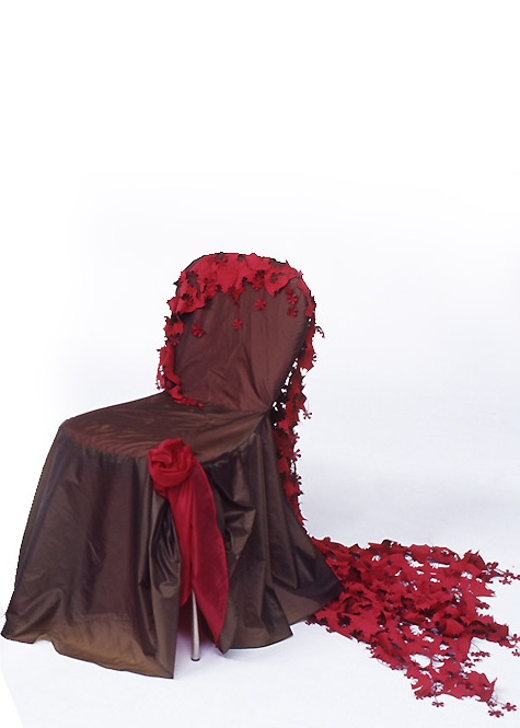
Tord Boontje: Doll Chair, 2005
“Decoration is the most general term for the art we add to art” writes Trilling, and in his terms, ornament is “decoration in which the visual pleasure of form significantly outweighs the communicative value of content.” So, the Doll chair comes close, but doesn’t qualify completely. Irma Boom’s cover design for the exhibition catalog Design and the Elastic Mind does. Ebulliently algorithmic lines, with all their weaving and spiraling, give shape to the letterforms so commandingly that they are the text’s raison d’etre. Additionally, Boom eloquently crafts intricacy and formal ambiguity — two properties, Trilling claims, that are central to ornamentation.
These characteristics permeate DecoRational work, what might be called things that are “decorated-within.” However, things that are “decorated-without” do sometimes fit within the conception as well. For example pure decorative form coupled with evidence of craft typical to a specific body of work might be congruent, as might work that demonstrates innovative use of material and technology. The cover of Love Poems by graphic designer Marian Bantjes is drawn with her recognizably skilled hand. Her decorative flourishes flow seamlessly into an über modern sans serif font — typographic ornamentation. A more elaborate poster she designed for the Academy for Educational Development exploits both the precision and imperfections of laser cutting, and maximizes the physical properties of plain white paper. And Strange Attractors’ self-initiated work “To the loss of our princesses” experiments with technologies as it regenerates traditional calligraphy.
DecoRational interests aren’t fronted by a manifesto nor backed by a roster of hereby concerned. It is not a call for reform but rather an appeal for inclusion. The portmanteau draws into view the “superfluous” designed stuff that surrounds us. DecoRational acknowledges sensibilities that often surface beyond the scope of design proper, some of which have proliferated since the mid nineties to find a place in the design mainstream. More modifier than movement, Decorational connects pleasure with function and values elaborate form (deco). At the same time it embraces systems thinking, tools, engineering and poetic abstraction (rational). “Deco” conjoined with “rational” knits craft traditions with contemporary technologies, the old with the new, tactility with computation, strange with familiar, and delight with utility.
Contextual originality
Discussions of decoration tend to focus on aesthetics, beauty and pleasure, whereas Decorational privileges delight. Delight can be beautiful or it might be unprepossessing. Delight speaks not only to form, but to the experience of the viewer — or user, wearer, participant. It addresses engagement with both the form and its evocation. Functioning as visual attraction and intellectual stimulus, Decorational work elicits delight, wonder, reflection. For instance, as pedestrians walk along the Mood Wall, located in a sketchy area of Amsterdam, they interact with digitally generated light, shape and motion. Not only does the piece illuminate the tunnel, (its primary function is to render this public space more safe), the decorative forms and their behaviors engage the imagination that revels in the mystery of the light waves that move along with the passer-by.
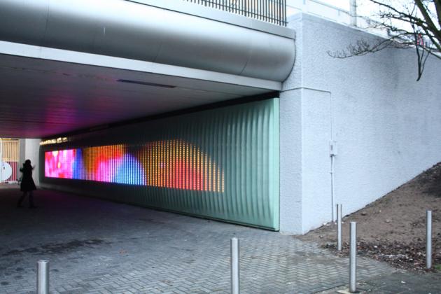
Urban Alliance: Mood Wall, Amsterdam, 2009
Common decoration and ornament varieties are aloof, mute to their histories and blind to their present moment. Often generic, they are transferable to any context and remain senseless. DecoRational, by contrast, is referential and deferential, demonstrative of past and present cultural contexts within which it is produced and functions, as the Mood Wall shows. Hypnopaedia, a set of very contemporary doodads created by Zuzana Licko for Emigre, follows the tradition of unique decorative sorts cut for a type family. Each interlinking character is built from Emigre types, and the system generates limitless border and pattern combinations, as only the digital context can. The “kit of parts” is adaptable to myriad contexts and conditions. For Hypnopaedia, Licko utilized “rotate and repeat,” a one-click command available in almost any software. Contextual originality centers on the font’s near exhaustive range of text color and texture, and on how it delights in exploiting computational precision. Delightfulness might be beautiful, or it might be unprepossessing. The Pattern Foundry, an online company that commissions and distributes pattern making fonts, offers a series by designer Paul Elliman comprised of graphic readouts from imaging tests and diagnostics. Although not classically beautiful, the pattern playfully aligns our digital screens with legacy graphic languages.
Herzog & De Meuron’s remarkably ornamented 40 Bond Street gate and façade in Manhattan serves function first. The ground floor of the building’s towering volume, is shielded with exuberant twists and twirls conceived to reflect the urban environment, “where graffiti is part of the landscape,” an inescapable context which would have been, in the not too distant past, ignored or erased. The result is a slightly disturbing transition between mean street and luxury residence, where pure decoration reminiscent of 1930s deco covers walls and ceilings.
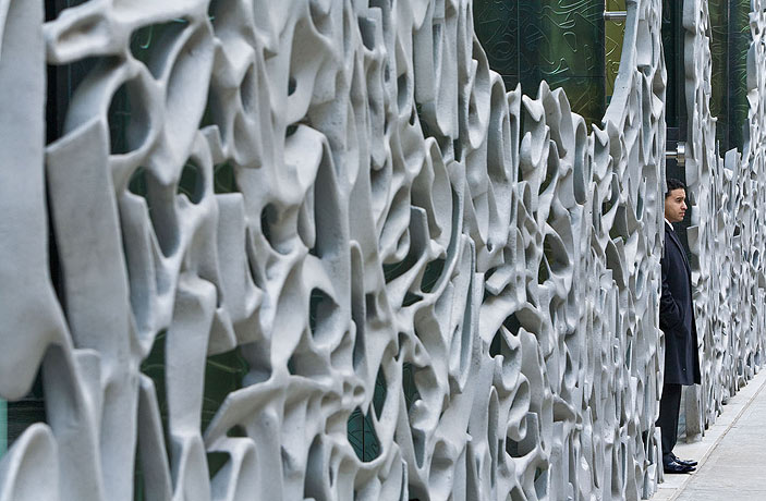
Herzog & Demeuron: #40, Bond Street, New York. Photo: Iwan Baan
conspicuously technological craft
Measures of good craft in design change over time because they are inexorably coupled to technologies. New skills become necessary to master, replacing older skills when new tools simplify certain tasks. Designers might scrap measures of good craft that were once seen as central, such as the sign of the steady hand, but then raise the bar in other ways. Because DecoRational designers tend to push the limits of manufacturing, or jump on new and emerging technologies while invoking traditional craft processes, their artifacts flaunt their technicals with unapologetic flair. The iconic Walt Disney Concert Hall in Los Angeles, like most recent buildings designed by Frank O. Gehry, shouts from undulating rooftops that it is as much product of sophisticated computation as it testifies to imagination and delight in pushing the envelope of construction. Similarly in all design disciplines, digital means have offered various ways of generating both structure and ornament in real time, which has introduced untapped decorative possibilities. The typeface History, designed by Peter Bilak, for example, merges interchangeable letterform parts with digital exactitude — twenty-one different sets. Stroke widths, serifs, slabs, curvilinear swashes, lines, outlines and shadows are engineered to combine seamlessly into a typo-graphic image with the aid of the online application “History Remixer.” The font construction system, then, is as integral to the design as are the nearly inexhaustible decorated (or not) typographic forms it generates.
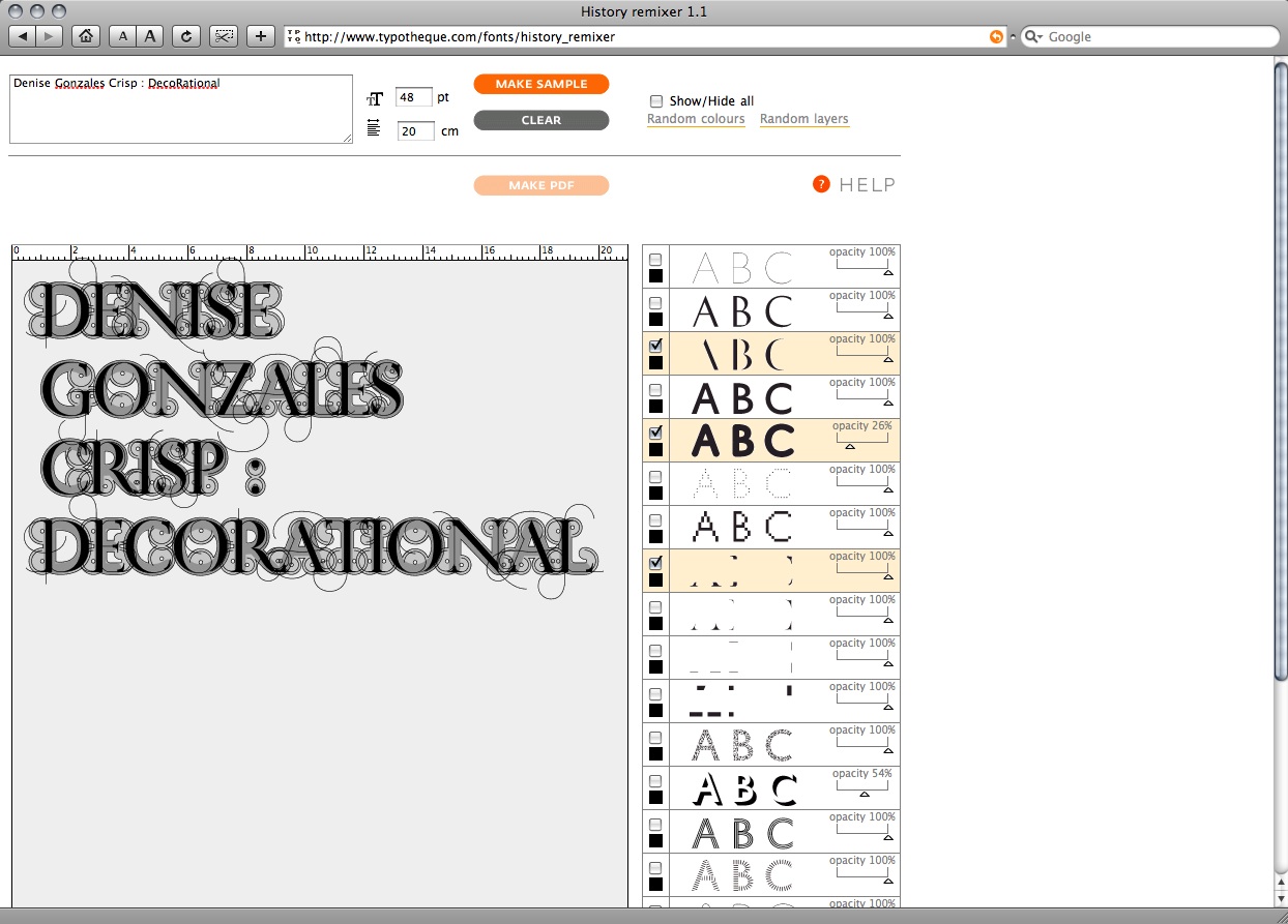
Peter Bil'ak: History, remixer interface
The logic of artisans and patrons — that is the system within which craftspeople work — is deeply historic. It respects innovation within traditions, whereas modernists favored originality and invention under the battle cry “make it new.” DecoRational understands that innovation is more generative, more frequent, and probably more likely than wholesale invention – innovation is DecoRational’s benchmark. As with all craft, the sophistication to select well from many options is key. Illuminated wallpaper, electronic cloth, dynamic typography, curious furnishings or unfathomable detail point up one additional characteristic of Decorational: a certain theatricality. Whether splendidly eccentric or humbly luscious, this work magnifies the ubiquitous and joyful oddments in our lives that dramatize uniqueness through visual and tactile delight. Judging from the abundance of innovative work exploring superfluity, designers are not only reviving decoration and ornament; together they have ushered in their utter renewal.
Denise Gonzales Crisp is graphic designer, critic and professor of graphic design at College of Design, North Carolina State University. Her work and essays have been published in a range of international exhibitions and magazines. At this moment, Gonzales Crisp is finishing her book Relational Typography: Systems, Context, Form, Message, which will be published by Thames & Hudson later this year.
This post is also available in English ... reageer




Wil je reageren op dit artikel? Stuur een mailtje naar de redactie.